Table of Contents
- Community Poster Project
- Teresa Russo
- An Overview
- Poster Content
- The Poster should answer these questions:
- How to list the items discussed on your poster
- Private Archive in your house or family member’s archive:
- An item in the archive/ private collection (discussed under “Materials”):
- If you are using an archive already catalogued in an institution
- Note: Private Family Collection
- An interview (discussed under “Materials”):
- Organizational Newsletters or Magazines
- An Organization’s Press Releases
- An Organization’s Meeting minutes
- A newspaper article discussed in your story
- A book discussed in your story
- Other Resources
- Poster Formatting
- Poster Samples
Community Poster Project
Teresa Russo

The Community Poster Project material has been developed by Teresa Russo (Ph.D.). She has kindly agreed to share her knowledge on how to create an academic poster with a set of instructions for platform recommendations and templates.
This page provides a set of information and examples for creating posters to be uploaded to the Italian-Canadian Narratives Showcase site.
Posters that follow these guidelines have been created as classwork at the University of Toronto and at Brock University.
An Overview
A poster project is a graphic, visual, and textual method of presenting information. An effective poster balances information with a layout design. The poster allows one to convey a message about a story or research into a simple and visual text. Sometimes poster projects are the early steps of a larger project and can lead to more research on a topic.
This document outlines the type of information and layout one should consider when creating a poster project. The information has been tailored to work with archives in your community in order to tell stories about Italian Canadian experiences. First, there is a review of how to create a story from an archive or an oral history. Then steps to formatting a poster layout is discussed with recommendations to poster templates.
Poster Content
- Title of poster and author information (supervisor information if applicable)
- Description of topic/Introduction or Background information
- Objectives (Purpose or Rationale for choosing this topic or story to tell)
- Methods (or Materials, Methodology)
- Results (or Implications)
- Conclusion with Recommendations
- References and Acknowledgements
The Poster should answer these questions:
1. Who?
Title of poster and author information. First place the title of research in 72” font size. Then include the author of the poster (and affiliation information if applicable). Author information can also be located at bottom of the last column with a person’s contact information if desired (see sample poster below). But author name still appears after the title in the heading area of the poster. (A supervisor name can be added in contacts or in acknowledgments if someone directed your research, edited or proofread your work. For instance, maybe an Italian Club president supervised community posters on the “Taste of Little Italy” and the person should be included under contacts or acknowledgements; see sample below).
2. What?
Description of your project’s topic; an introduction or short background of the topic you have decided to discuss for your poster project. This could be a story on immigration, on a family member working in a particular industry or opening their own business, a family member winning an award, or even the loss of a family member while working in a particular industry. A community can work together to record a local Italian Club or heritage building.
3. Why?
Purpose for your research; a rationale… Main aims and objectives of your piece. Objectives explains why you are telling this story. You want to explain that you want to honor a family member because of their work in the community. Maybe you want to provide a perspective on immigration. Maybe you have a family member honored on a fallen worker memorial and you want to tell their story fully. Maybe you found your grandparent’s documents and your reason for the poster project is to catalogue their records or tell a story from the documents you found. Maybe your objective is to provide a historical account of an annual community event or record how an Italian Club originated in your community.
Some people may include Introduction and Objectives as one heading and explain what and why together in various paragraphs or in a bullet-point list.
4. When, Where, and How?
Explains your Methods or observations of any archive you are using for this poster project (also called methodology on some posters) (see explanation of this category with Results)
Methods and Results are used to explain one’s methods and what the information implies (results). For instance, you have an archive at home. Your “materials” for this project are items in an archive or in a “private collection” of a particular owner, who can be your parents or grandparents or a friend. (Maybe you are the owner of a collection; you will explain this under methods.) Many things could be discovered from a personal archive. Maybe you found a letter that describes how a family member opened a grocery store or restaurant in the early 1900s. That letter is a “material” because you are reading that letter as evidence that your family member had a restaurant in Little Italy. The “implication” of the letter is your proof that a family member in the 1920s owned a restaurant. So, in a few sentences you will state on the poster that the letter is your material or methods and it implies a certain outcome (family owned stored, family member is a fallen worker, etc). This process is gathering evidence from an archive to prove the story that you are sharing. (The methods or methodology, for this example, can be explained as “working with an archive to tell a story.”)
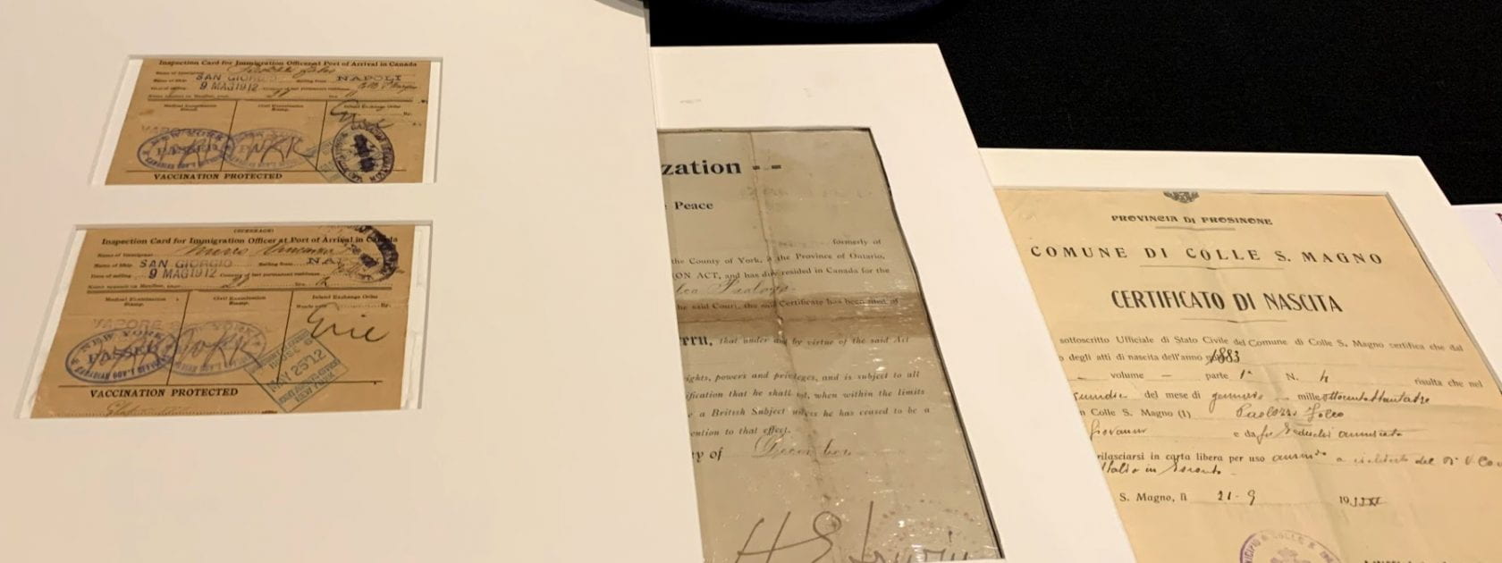
A passport, immigration papers, work papers, union papers or membership cards as well as photographs are all types of items that can be in a home archive and part of a private collection. Under Methods you want to describe your archive (30 photographs, a passport, a certificate from the workplace, 10 letters etc). Then for results you may focus on one item or a few of those items as your proof that this particular story is true. Therefore, if your family member won an award your proof is a photograph taken at the event that your family member attended to accept the award. Maybe in your family member’s private documents you see the certificate or award; you can scan or take a picture of the certificate and include it on your poster with a caption.
Another example is an organization’s documents as an archive. Your community may have an Italian Club and maybe your objective is to record the history and founders of the local Italian Club. Your materials, in this case, maybe newsletters, press releases, and meeting minutes that the secretary of the club has filed by year at an Italian Club building. This is a club’s archive and these documents in addition to photographs of the club’s events can be your evidence of the club’s existence and evidence of its history that can become a story for a poster project.
5. So What?
Explains your Results of your examination of the archive (also called Implications)
Methods is also conducting an interview for oral evidence. For instance, you may want to interview a family member to provide a description of the story you are trying to tell on the poster, or you may want to interview a member or officer of the city’s Italian club for your story on the history of the Italian Club. You can write up the interview on paper or record the interview. Some people record the interview and place a YouTube link of the recording on their poster under the heading References (see example in issue 2 of Archival Research of Italian-Canadian Immigration and Culture). By writing the interview on paper or recording an interview, you created an oral history that can be read or heard by many people to understand a certain event or a personal story. Under Methods, you will explain how you created an interview(s).
For Implications or Results, you would then explain your oral history and then explain that “as a result of the interview” you have more information about the topic; you may explain it is the perspective of a certain family member who came to Canada or was born in Canada at a certain time period so that their perspective is important to your poster’s topic.
Sometimes Methods and Results can be a heading together on the poster and explained in various paragraphs or in a bullet-point list. Other headings that can be used for Methods is Materials or Methodology, while some people choose Implications as a heading for Results to indicate what evidence the archive provides or “implies.” You can choose any heading you would like for this section to discuss your materials and results. (You can give these headings a title like “My Family’s Archive”; Toronto’s Italian Club Archive; Nonno Giuseppe’s Letters; etc. and then explain these documents as materials and methods with its results; see last poster below for use of headings pertinent to a topic.)
6. Now What?
A conclusion with a discussion of related literature or recommendations of other research areas.
“Now what” brings your story to a conclusion with “recommendations.” Recommendations can be twofold. Some people include further research that can be done on this topic and others focus on providing recommendations to the reader of where they can find more information on this topic. In some cases, people include both information in two different paragraphs (or list the recommendations in a bullet-point list) after concluding remarks.
For instance, you told a story based on an archive at home that your family member is a fallen worker. Under this heading called Conclusion and Recommendations, you may say that you wish you could speak to some people who witnessed the tragic event to learn more information on what happened to your family member. This is a future goal of yours to expand your story on another poster project in the future or you may recommend others to do more research on this incident and tell other stories about the topic you presented on your poster. Thus, this is your recommendation for further investigation on this topic.
In addition, you know that your family member’s name is on a memorial wall; you can include a photo of the memorial wall and then recommend people to visit the memorial wall to honor all fallen workers. Your family member may also be included in a book or newspaper article, so you can recommend related literature and tell people to read more about your family member in the Globe and Mail (provide date) or in the book Land of Triumph and Tragedy by Paola Breda and Marino Toppan. In these examples you are making recommendations to your readers on materials where they can find more information on your story.
Conclusion and Recommendations can be discussed under one heading or separated into two different headings (see samples below).
7. References and Acknowledgements
Provide a list of your materials or sources in alphabetical order and thank those who have supported your research. First list your items and then at the end of the items thank anyone who helped.
This section is essentially a list of works that one consulted for their research. In most cases you described the archive under Materials. You now include here in a very simple visual list the items discussed in your story (see sample posters below).
How to list the items discussed on your poster
Private Archive in your house or family member’s archive:
- Name of creator or author who put the collection together
- Name of person the archive belongs to
- Range of years that the items in the archive represent
Samples
- Russo, Teresa. The Private Collection of Giovanni Russo, 1940-1960.
An item in the archive/ private collection (discussed under “Materials”):
- Name of creator or author who put the collection together
- Title of a specific item (passport, letter, etc.) in the archive
- Date of that item
- Name of person the archive belongs to
Samples
- Russo, Teresa. “Passport of Giovanni Russo,” 1940, in The Private Collection of Giovanni Russo.
- Russo, Teresa. “Membership of LiUNA!,” 1945, in The Private Collection of Giovanni Russo.
If you are using an archive already catalogued in an institution
Follow the institution’s recommendation and include the box and file number of the item. If your archive was donated to an institution, the institution will assign a box and file number; in this case then, you would add the box and file number after the date:
- The creator or author
- Specific item title (passport, membership card, letter, photograph, etc)
- Date of item
- Box and file number (for an archived organized by an archivist at an institution).
- Name of the archive
Note: Private Family Collection
Please note if you are handling a family member’s private collection, you want to keep the collection in its original organization because it reflects more authentically the owner’s collection. If you are handling an archive at an institution, you also must keep the archive in its original order. The archivist will provide “place holders” for an item you want to take to photograph or photocopy; the holder indicates exactly where you need to place the item after you have copied it. Please see the archivist before moving items to photocopy. Also, only photocopy and photograph items from an archive with permission from the owner or institution (you can thank people and institutions for these permissions after listing your items as references).
An interview (discussed under “Materials”):
- Name of person who conducted interview
- Title (which begins with the words “Personal interview”
- Date (day/month/year)
Samples
- Russo, Teresa. Personal interview of Giovanni Russo. 20 October 2019.
- Name of the author
- Title of the article in the Newsletter
- Title of newsletter
- Publisher or Organization
- Date of the newsletter’s publication
- Page numbers
Samples
- Oldenberg, Don. “Big-Screen Italian Chemistry.” Ambassador, The National Italian American Foundation, Winter 2018, 40-42.
An Organization’s Press Releases
- Title of Press Release
- Name of Organization
- Date
- Words “Press release.” added at end of citation
Samples
- “The National Italian American Foundation Statement on the Tragic Death of Kobe Bryant.” The National Italian American Foundation (NIAF), 28 January 2020. Press release.
- “ICAP SPRING UPDATE 2020.” Italian Canadian Archives Project (ICAP), 28 April 2020. Press release.
An Organization’s Meeting minutes
- Title of Minutes
- Name of Organization
- Date of the meeting
- City of the meeting
Samples
- “Minutes of ICAP Annual General Meeting.” Italian Canadian Archives Project (ICAP), 25 October 2019, Niagara Falls, Ontario, Canada.
- “Minutes of the NIAF Executive Council.” The National Italian American Foundation, 20 October 2019, Washington, D.C.
- “Minutes of the NIAF Budget Committee.” The National Italian American Foundation, 10 November 2020, Washington, D.C.
A newspaper article discussed in your story
- Name of author or authors
- Title of article
- Title of newspaper Include city in brackets
- Date (month/year)
- Page numbers if applicable (some newspapers located online do not provide page numbers; then end with the date)
Samples
- Bradbear, Janice. “Once Upon A City: Toronto’s Labour Pains.” The Star [Toronto], September 21, 2016.
- Bradburn, Jamie. “Historicist: Disaster at Hogg’s Hollow” Torontoist [Toronto], March 20, 2010.
- Ghafour, Hamida, and Charles Valentini. “Survivor Recalls Hogg’s Hollow Disaster.” The Globe and Mail [Toronto], March 16, 2000. Print.
- Note: Some people may add the word “Print.” after the date in order to distinguish from “Web.” entries in their References, as seen in the last example above. If one decides to include “Print.” and “Web.” classification, then be consistent and do this for all entries in References.
A book discussed in your story
- The name of the author or authors
- Title of book
- Name of Publisher
- Date of Book
Samples
- Breda, Paola with Marino Toppan. Land of Triumph and Tragedy: Voices of Italian Fallen Workers, A Century of Italian Immigration to Canada: Immigrants who Made it and Those who Perished Trying. Verita, 2019.
- Iacovetta, Franca. Such Hardworking People: Italian Immigrants in Postwar Toronto. McGill-Queens University Press, 1992.
Other Resources
The Advisory Panel will be happy to assist you if you need to know how to list any other resources on your poster.
Poster Formatting
Poster Size
- Most posters are 36” x 48”; keep ¼” free all around or add a bleed.
- Landscape posters have more layout options then a portrait poster; The portrait size only allows for a layout with two-columns.
Choose Your Design Tool
- Microsoft Publisher, PowerPoint, Photo Shop, Apple Pages, Studio Publisher, Illustrator, Adobe PageMaker, CANVA
(Photo Shop, Publisher, and Illustrator are good programs to use; other file types can be converted to PDF by printing companies. PowerPoint is a good program too, but there is no “true blue” and you need to avoid overlapping text boxes. With some of these programs (like PowerPoint), you need to adjust the file size to the size of the required print size, such as to a standard poster size of 36”x48”, before beginning the poster design because printing companies will charge a design fee to correct the image size.)
Templates can also be used that are compatible with platforms in MS Office. (Students have access to these with their Student ID; see IT support at your high school or university for assistance. Students should not pay for software, platforms, or templates)
When searching for other templates, select “academic poster” rather than “scientific poster.” Scientific posters are used to provide scientific information. Templates categorized as academic posters are used for community-based poster projects that focus on telling a story and providing historical information.
Sample Templates
Sample templates can be found at Poster Presentations (note that for some templates you cannot adjust columns, empty space area, or design; however, columns, font size, headings, etc. are already customized and ready to use. You can adjust the text size, font type, and rename headings to the template and even change colour palette in the template).
https://www.posterpresentations.com/free-poster-templates.html (Links to an external site.)
YouTube also provides a How to video on designing a poster (note this video was made for students to follow and prepare a poster to present at a conference; the poster in the video is created in portrait layout, while the landscape layout may be better for this poster project):
How to make an academic poster in powerpoint – YouTube.com
Length/Layout
- 20-30% Text / 40% Graphics or Images / 40% Empty Space
A landscape layout should follow rule of thirds (or fourths), creating a three column or four column design as showcased below. The columns will provide a clear organization to the material and a clean design. In PowerPoint, use gridlines and guides to make sure all your text boxes are aligned in the layout, and adjust the spacing between the columns to 1.5 inches. PosterPresentations.com already does this for you.
Text
- Should Consider who, what, why, when, so what, now what (described above)
You can use short sentences, simple words, and bullets to illustrate points, but make sure sentences are complete (no fragments or incomplete sentences); you can also present the text in paragraph form. Fit blocks of text into a single column or area; add emphasis to headings and subheadings by using boldface, underlining, or colour; each section of text should make sense if read alone. (Look at last poster below where the author gave a title for each heading while still answering the questions that refer to methods, results, etc. You can be creative with your poster and still tell a story with all the required categories.)
Font for Text:
- Title Heading: 72 point (PowerPoint use 85 point – 110 point to fill in the heading space); Must be easily read at a distance of 4 feet
- Author Names after Title Heading: 56 points
- Subheadings: 36 point
- Body Text: 24 point (posterpresentations.com allows up to 28 points)
- Captions: about 18 points
- Non‐decorative font is best for this project
Non-Serif fonts like Arial, Helvetica, Verdana, Trebuchet MS, and Gills Sans MT are great for headings and subheadings, while Serif fonts, such as Rockwell, Garamond, Palatino, Book Antiqua, Bookman Old Style, are great for the body text and captions because these fonts are easier to read at a smaller size. Stay away from using Comic Sands MT, cursive fonts, and fonts that will make smaller text hard to read.
Colour Suggestions
- Use primary and complimentary colors
- Dark background, lighter visuals OR light background, darker visuals
- Dark colors for borders
- No fancy backgrounds that my cloud words
With PowerPoint (and perhaps with other design tools) avoid certain color combinations: blue/black and blue/purple. Other difficult colors on the eye are red/green and brown/green. In PowerPoint, also use colours from the same “theme” colour palate. PosterPresentations.com automatically does this for you after you choose your main colour theme.
Images
- You can photograph items from the personal archive that you have cited under Materials or discussed in your story.
- You can scan photographs from the archive and then add the image to your poster.
If you take a photograph of a photograph, make sure your image is clear and has no flash marks on the image you made. Scanning is a better way to create a better image.
You can also take current images of restaurants, businesses, or cites where a business once stood to tell your story. You can take photographs of memorial walls or of gravestones, schools, parks or locations important to the story that you are telling.
Consider resolution when you are taking photographs or using images from the web (approx. 1200px x 900px). Raster files, which include jpeg, png, bmp, or tif, provide great high-resolution images. (You can check if an image is blurry or pixelated by zooming in your poster document at 300%.)
Choose web images carefully with resolution in mind, such as downloading an image of a newspaper article (see first poster sample below) and make sure to provide information of the image in a caption. Maybe there is a memorial wall already photographed and located on the web, make sure to provide photographer’s name or in caption state “no photographer credited”/ “photographer unknown” so that your readers know that you tried to credit the photograph.
Keep copyright in mind – images from an archive located in an institution will come with copyright information; museums and libraries will also provide copyright information. You can place the archive number and archive name in a caption under each image. Then add institution name under acknowledgements, especially if an archivist assisted you at the library or museum.
If your image does not have a caption, then the image should be discussed in the text above or below the image, so readers understand how the image represents the story.
Visuals and Graphics (If applicable to your story):
- Use visuals to explain results and illustrate ideas and concepts
- Use visuals to engage the audience and evoke emotion
- Visuals should be simple, clear, and high quality
Explain visuals with captions if necessary (if you have taken a visual from a book or newspaper note the information in the caption or explain you created the chart using data from a newspaper(s) or books and add the article or book to your References)
Figures (if applicable to tell your story):
- Labeled axes
- Title and/or caption
- Legend
- Readable font
- Visible trends
- For charts and graphs, paste directly from excel if possible
Explain the figure with a caption if necessary and add in a caption if you have taken a figure from a book or newspaper or explain you created the chart using data from a newspaper(s) or books; then add the article or book to your References.
Criteria
The content of the poster will be reviewed on the following criteria:
- The subject matter is clear to the reader.
- The evidence (archive or data) provided on the topic is clearly stated.
- Clear description of the archive used for your story is provided.
- Results of evidence is presented (as explained under Material and Results above) and if applicable, an explanation of results for graphs, figures, or visuals is included.
- The design and layout present the topic clearly.
- The images are clear and appropriate to the overall subject of the poster’s discussion.
- Captions are included for images and connect to the overall subject of the poster or images discussed in text. (If captions are not used, then images are discussed in the text.)
- All sources and materials cited in References.
- Anyone, who has assisted you in creating this poster or gave you permission to use materials for the poster or created the poster design etc., (if applicable) has been named in Acknowledgment.
- Quality of writing: making sure all words are spelled correctly and bullet pointed text is formed in a sentence.
Printing the poster
When printing the poster for a local event or to present at a conference, make sure you print a week in advance. Most posters cannot be printed same day due to its size. You also will have the option to select 20lb, 46lb, or semi-gloss paper. 20lb is a handout paper type; 46lb is double the weight of handout paper and sturdier; semi-gloss is the heaviest and more expensive paper. (Consider also how the poster will be displayed before choosing the type of paper: for instance, will the poster be attached to a poster easel or will you require tape to display the poster.)
Poster Samples
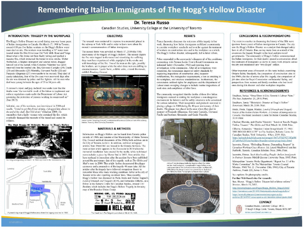
(A poster with four columns, using posterpresentations.com; the template from this company opens in your PowerPoint software where you then begin to add your text and images. Make sure to save your working copy before creating a Pdf of the file so you do not loose your original file and can make changes to your poster. Notice how the author used an image from an archived newspaper and images from the city of Toronto to discuss memorials in the community. This poster also has contact information at the bottom of the fourth column. Members of institutions may want to use this option to provide contact information.)
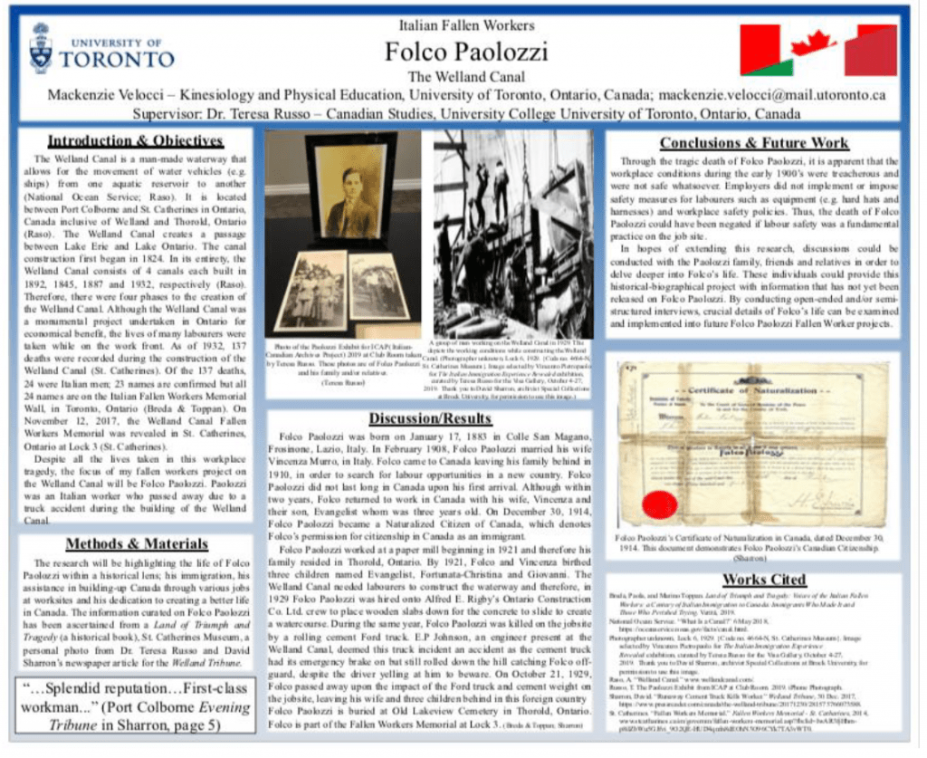
(The author created her design in PowerPoint; notice she added supervisor information. This information could also be placed under Contact heading after author information, see more samples in Archival Research of Italian-Canadian Immigration and Culture in the Italian-Canadian Narratives Showcase. Notice her use of a certificate of naturalization as one of her images. She also decided to acknowledge those who contributed to the research under Methods and Materials as this design did not have any more space for acknowledgements under Works Cited, a heading she used rather than References.)
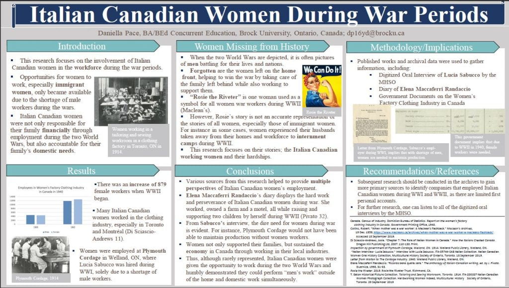
(A poster with three columns created in PowerPoint and saved as a one slide Pdf. The author designed her own columns. Notice her use of a graph in column one and photocopies of letters as her “evidence” under the heading of Methodology/Implications in column three.)
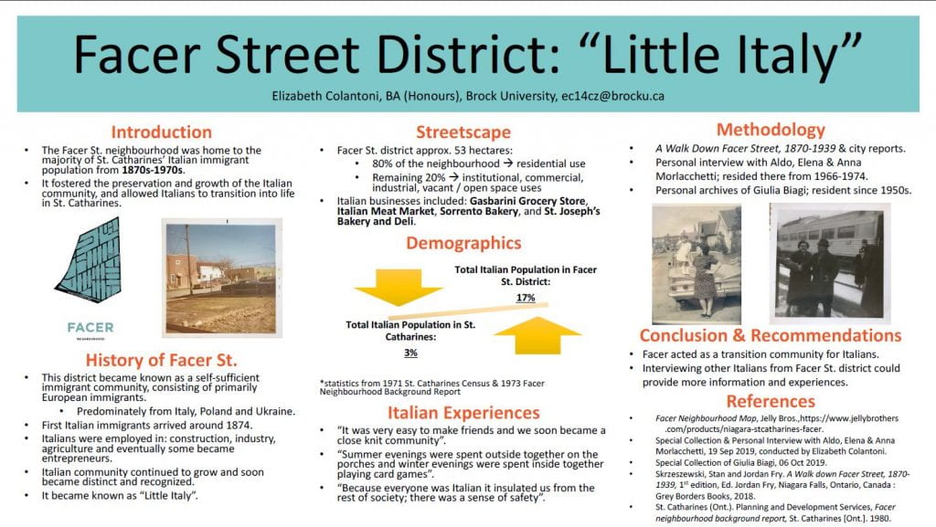
(A poster with three columns created in PowerPoint. The author decided not to show the column borders, but created the columns with the text and images; she left proper spacing in between the text (1.5 spacing). She features images from a family archive; her methods were both an archive and interview. Notice that she creates her own graph, located in the second column, in order to provide a perspective about Little Italy, St. Catharines.)
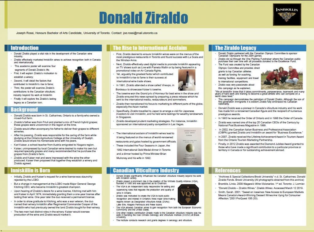
(This author’s PowerPoint software was a student license and had “an academic poster” template. The template follows rule of thirds and the author created his own headings based on his researched archive but still answered all the questions required for making a poster project. The author researched an archive on Donald Ziraldo at Brock University’s Archives and Special Collections and discussed the contribution of Ziraldo to the wine industry in Niagara. Your local libraries or museums may have archives with information of your city’s history and can be researched to create a story about the contributions of Italian Canadians in your community.)
Thank you to A-Z Learning Services at Student Development Centre, Brock University for technical information on formatting poster projects (poster size, length, colour, visuals, figures) for this document.
All these posters included here are featured in Archival Research of Italian-Canadian Immigration and Culture in the Italian-Canadian Narratives Showcase (ICNS), that will be available directly from ICAP’s homepage. Thank you to Sandra Parmegiani for creating a site to showcase undergraduate poster projects.


